
Card
Core can build a card from a Group with an Image, Heading, Paragraph and Buttons inside, but there is no badge, no hover effect, and no way to make the whole card a link without breaking the button inside it. This block is one card: an image above, below, beside or behind the text, a badge in seven places (including a corner ribbon) with an icon, an eyebrow, a title and text you edit in place, and a solid, outlined or text button with an icon that nudges on hover, pinned to the bottom so a row of cards lines up. The whole card can link somewhere while the button keeps its own link and stays clickable. Five card hover effects (lift, grow, sink, shine, a line) and six image effects (zoom in or out, slow pan, rotate, black and white to colour, blur to sharp).
Ready-made patterns
Inserter → Patterns → Moduly: three story cards, two cards with the image behind the text, and a side card.
Trips for the season
 New
A weekend in the Dolomites
Three trails, two mountain huts and one unforgettable sunrise above the clouds.
 Popular
Slow days on the Algarve
Cliff paths in the morning, long lunches and a swim before dinner, every day.

Hills and vineyards
A gentle loop with tastings on the way. Short enough to leave room for a nap.


 Save 20%
Travel Club
Early access to every trip, a free guide each season and 20% off all bookings.
With the media library
The whole card links to a post; the button links to the shop and stays clickable · grayscale to colour · shine


Image on the right · text in the middle · no shadow, a border instead · image below the text, no badge

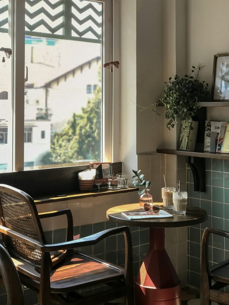
Ninja drop tee
A heavier tee with a dropped shoulder.